Susannah Fiennes
ARTIST
Lecture
In their presentation of exhibitions, there is a tendency amongst museum curators to write expansively on background history, artist’s biography and the subject matter of the painting, all of which can he useful as a way of seeing a picture in context. However, when it comes to helping the viewer to see a painting from an aesthetic point of view, the curators are found wanting.
As an alternative, they supply often vacuous descriptions of the work or may make banal references to expressive brushstrokes or the ‘stunning use of colour.’
It seems to be unfashionable to offer guidance on how to see a picture; this could appear prescriptive and might interfere with our subjective response. Therefore, instead of giving the viewer a greater understanding of the artist’s intention, the curators can obscure many of the truths inherent in great painting. Consequently, the viewer is being denied access to the painter’s point of view.
The late art historian, Kenneth Clark, in his book ‘Looking at Pictures in 1960 wrote: “Looking at pictures requires active participation. One can learn to interrogate a picture in such a way as to intensify and prolong the pleasure it gives one”.
Extracts from recent catalogues
I agree with this statement, and I would like to attempt to redress this balance. But before considering the key elements of the grammar of painting, I’m going to quote some extracts from these curators to illustrate my point. Then I will come back to the paintings they discuss, and look at them from an artist’s point of view.
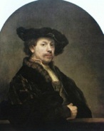 Rembrandt Self –Portrait 1640 National Gallery
(Exhibition: National Gallery 1999)
In the audio guide to this exhibition we are told that: “one of Rembrandt’s great triumphs had been to paint skin in such a way that it suggested living flesh”. He “captured a likeness”.
There is also speculation, which I believe unhelpful, on why he liked dressing up and making faces in his self-portraits.
Chardin The Young Draughtsman 1737 Louvre
(Exhibition: Metropolitan Museum/National Gallery 2000)
The curator writes in the catalogue that Chardin is interested in the “strict equilibrium of the composition as well as in the subtle use of colour”. “Just as important, is the artist’s delicate psychological analysis of his model, seen leaning so gracefully over the table.” “The expression of gentle satisfaction (and anxious reserve) on the young draughtsman’s face as he contemplates his drawing while sharpening his chalk gives the scene the peaceful feeling of tranquility that is the artist’s speciality.”
There are catalogue essays on subjects such as ‘Ceramics and Glass in Chardin’s Painting’, ‘Property and Sources of Income’ and ‘Utensils and 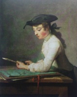 Household Objects’, but not on how to see the pictures.
Velasquez The Water Seller 1618, Apsley House
(Exhibition: National Gallery 2006)
The catalogue describes the trickle of water as a “detail of no particular significance in itself, but Velasquez’s ability to render it in paint, particularly the changes in texture from the dry terracotta to the recently wetted areas is stunning.” The picture “transmits a sense of physical reality striking in its refinement, simplicity and gravitas…The volumes play against each other, contrasting with the faces of the water-seller and his customers.”
The audio guide to the exhibition said: “Velasquez depicts nothing more than what we see here…and he treats his subject with a kind of sacramental gravity as if it’s a moment of great importance… it’s clear that he found a kind of elemental importance in the mundane, the everyday.”
Clearly I have quoted some of the more egregious examples to make my point, but there is nothing specific in these comments about the aesthetic, formal language used by artists since the renaissance to represent the three-dimensional world on a flat surface. Yet, I would suggest, these artists are primarily responding to the excitement of light sensations, just as Cezanne sought to ‘organise his sensations before nature’ and Monet “ undertook to 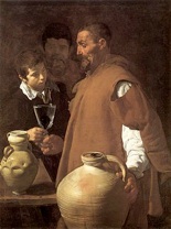 prove that the object was of no importance – the sensation of light was the only true subject.” Just as writers or dramatists organise experiences into stories or plays using structure and grammar, and western composers have used a seven-tone scale, a painter must make an equivalent for the three-dimensional drama by using a formal system.
The language of painting
I would like to introduce you to the essential grammar of the language of painting. This comprises three elements: composition, drawing and colour.
1. Composition
Begin with rectangle which can be a postcard with a rectangle cut out of the middle. This allows us to mimic the picture frame, and to view the object through the rectangle and observe the scale, proportion and distribution of masses.
Think of a rectangular theatre stage in which the drama takes place. Within the boundaries of the rectangle, artists use a flat, two-dimensional arrangement of coloured shapes to make an equivalent for the three-dimensional illusion of form, space and light. These flat shapes may vary in size, colour and pattern, like a jigsaw puzzle. What matters is the proportional relationship of parts. Cezanne spoke of a ‘harmony parallel to nature.’ The Florentine, Leon Battista Alberti in his treatise On Painting of 1435, wrote: “Composition is that rule in painting by which the parts fit together.”
2. Drawing
Drawing is the means by which we articulate the illusion of volume, space and light on a flat surface.
There are two approaches:
a) Linear or contour
b) Tonal shapes
Drawing is not simply copying an outline or silhouette, but representing the connection between things. Each line in a drawing must have its position on a flat surface, as well as represent a volume or plane in space. Geometry is the relation of lines, surfaces and solids in space.
3. Colour
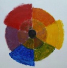 The value of a colour can be described in three ways:
Saturation is it more or less colourful (think of red London bus)
Tone relative light and dark (think of black and white film)
Temperature relative hot and cold ( think of a mood, like a musical key)
All these elements are relative; like notes of music in a melody, colours take their value from their surroundings. Nothing exists in isolation.
Various painters have sought to describe the language of painting:
Matisse said: “I don’t paint things, I paint only the relation between things”.
Titian said: “A good painter needs only three colours.”
Monet said to his pupils: “Try to forget what objects you have before you – a tree, a house, a field, or whatever. Merely think, here is a little square of blue, here an oblog of pink, here a streak of yellow, and paint it just as it looks to you, the exact colour and shape, until it gives you your own naive impression of the scene before you.”
Leon Battista Alberti in his Treatise on Painting of 1435 wrote: “All knowledge of large, small; high, low; broad, narrow; clear, dark; light and shadow and every similar attribute is obtained by comparison…thus are all things known by comparison” and “Grace will be found, when one colour is greatly different from the others near it… there is a certain friendship of colours so that one joined with another gives dignity and grace.”
Henri Matisse wrote nearly five hundred years after Alberti: “Colour does not exist in itself – its quality comes from its surroundings…from the relationship I have found in all the tones, there must result a living harmony of colours, harmony analogous to that of a musical composition.”
How artists express an idea
We should now look at how various artists, over a period of 600 years, express an idea, or a story or a particular mood in a painting by using these pictorial, formal devices:
Titian Rape of Lucretia 1570 Fitzwilliam Museum
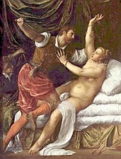 This picture was painted for Philip II. Here is a dramatic, violent subject, unlike Duccio or Chardin, in a very different key. But, like Duccio, Titian establishes the picture plane with repeated verticals (Lucretia’s raised arm. the right edge of white cloth ver her thigh, and Tarquin’s left collar) and horizontals (front of bed, her left upper arm). The lower mattress comes on square of the picture; her left hand (a pivotal moment in the story as she pushes Tarquin away) comes in the centre of that square. His raised elbow, nose and left little finger make a square with the bottom of the picture, and the centre of that square is his knee meeting her thighs (another key moment in the story). Titian makes a scaffolding for the drama to unfold. Against this he establishes the dramatic, diagonal thrust of Lucretia’s body extending from the bottom left of the picture to the top right. This lies at 90 degrees to Tarquin’s raised arm, creative maximum conflict. Both their raised arms lie on the picture plane and the ellipse of his white sleeve echoes her face, while his collar leads to her left fingers.
The colour key is loud with strong dark/light contrasts, and the drama is further heightened by setting the hot red breeches and stockings of Tarquin agains the mossy green (the complementary colour) curtain behind. The cold white of the sheet contrasts with Lucretia’s warm flesh.
Matisse Interior with a Violin Case 1918 Museum of Modern Art, New York
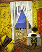 Here is another contrasting image: Matisse spoke of wanting to paint pictures “devoid of troubling subject matter, something like an easy chair”. Like Duccion and Titian before him, he has constructed a framework of verticals, and a sequence of horizontals, to emphasise the picture plane. The diagonal of the violin takes us into the pictorial space and points to the top right corner of the picture. Other diagonals echo this angle, such as the left white curtain and the left edge of the dressing tabe. The vertical inside of the window frame is extended by the dressing table edge, as a reminder of the flat picture plane. The edge of the dressing table is 90 degrees to the cutrain tie, the curve of which echoes the rounded bottom of the violin case.
A harmony of saturdated primary colours makes an equivalent of the hot Mediterranean light. Black is contrasted against white, a purple shaodw on the floor plays agains the complementary yello wall and a green tree outside the window complements the red wall on the right of the picture.
I would like to come back to the three pictures shown at the start, equipped with a better understanding of the tools used by artists, and look at them from an artist’s point of view. What could the curators have usefully included in their texts?
Rembrandt may have enjoyed dressing up in hats and jewellery in order to show off his new wealth, but perhaps the elliptical hat afforded a useful device for describing a volume in space, as well as a clean, dark tone against which to read the delicate lights in the flesh. How does he paint skin and make it the “great triumph that suggests living flesh”? A likeness is not ‘captured’- it is constructed by acute observation of woven shapes of contrasting tones, temperatures and saturations. Rembrandt is highly responsive to the drama of light sensations. I suggest that when he was making faces, he was creating particular patterns of shadow and thus making mystery.
Chardin: Young Draughtsman
The exhibition catalogue refers to the “strict equilibrium of the composition”. But what exactly does this mean? The picture is divided into three sections (foreground, middle ground and back ground). The boy’s eye and red ribbon come on the central vertical. The right corner of the hat makes a square with the bottom of the painting, just as the front of the table makes a square with the top of the painting. The horizontal table reasserts the picture plane, which is counteracted by the green folder making a diagonal into the pictorial space. The boy’s left arm contradicts this and leads to the focal point of the brush. The angle of the raised brush establishes tension with the upper arm and the front of the boy’s chest, making a tilted right angle. The front of the hat leads the eye down to the brush. The vertical red ribbon at the bottom of the picture takes the eye up to the boy’s face, and reasserts the picture plane. The overall design of the boy leaning inwards creates an equilateral triangle which is echoed by the triangle under his arm. i would suggest that the “peaceful feeling of tranquility” is a result of this formal design.
Chardin’s “subtle use of colour” is indisputable. But why not tell us how it is subtle? The picture has three main tonal areas: the light of the boy’s shirt, the mid tone of the grey wall, and the dark of the shadow down his back linking into his hat. The key is in the juxtaposition of red (the ribbon and the boy’s cheek) with its complementary colour (that colour which is opposite ton the colour wheel) green (the drawing and the boy’s apron). The grey background is made by neutralising the red with the green, making a bridge between the two extremes of colour.
Velasquez
I suggest that the “almost sacramental gravity” described in the audio guide comes through the organisation of the picture into three parts, as noted in the Chardin above. The dramatic light comes from the left. There is a vertical from the eye to the left edge of the pitcher. We are told that the “trickle of water… is stunning”. But how? Just as Rembrandt paints an illusion of flesh, the image of water comes from the precise drawing of particular shapes of colour and tone. “The volumes play against each other”, we are told: this is true, but how? We should look at the volume of the man’s chest echoing the pitcher, and the way Velasquez repeats the ellipses (such as the rim of the two pitchers and the glass).
Velasquez proves that drama and light in a painting do not have to be made using bright colours, just as music does not have to be loud to be expressive. Here, he depicts varying temperatures and saturations of yellows, from the man’s rusty coat to the pitcher to the flesh. He makes a square from the table to the top of the man’s head. As in the Chardin above, the horizontal table asserts the picture plane, whilst the diagonal table edge describes space.
* * *
Whilst it is undeniably useful to have biographical facts, subject matter, allegory, symbolism and social history explained, it should not be at the expense of the aesthetic. We must redress this balance and reinstate the importance of the visual – the‘active participation’ described by Kenneth Clark.
The distinguished curator of the Chardin Exhibition said: ‘It’s not my ambition to explain the miracle, the magic of Chardin…great painters have always eluded enquiry. But surely this precisely should have been his ambition? Museum curators have a vital role; that of helping an artist be properly seen. Curators could help this cause by including a deconstruction of the visual components of a picture in their accompanying literature, equipping the viewer with the tools for a fuller understanding. We could challenge what is currently being written and demand that an artist’s point of view be heard.
Learning to see pictures is not an end in itself. Just as writers of fiction help us to understand human relationships, great painters teach us to see the underlying harmony in the world and the relative value of things. The everyday can be transformed, and our lives greatly enriched by active visual participation.
Referring back to the colour wheel, we delight in the person in a red hat walking through a green field, or the gold cornfield against a blue sky. Chardin teaches us to celebrate the little triangular shape of light revealing the plane of a cheekbone or the space between an arm and a body. Duccio shows us the echo of a raised arm against another or the dancing shapes of light between a row of trees. Rembrandt and Velasquez prove that colours can be quiet but infinitely expressive like the grey, unsaturated colours on a wet pavement.
“The eye must be taught to see Nature,” said Chardin.
We must be taught to see paintings.